

COVID-19 dataset download complete!.
What now? You must be thinking.
That is exactly what I used to think when I started this long yet exciting journey into the planet of data science.
I will stare at a dataset folder on my computer screen like a sheep that just lost it’s sheperd. Lost, confused and utterly frustrated I find myself watching a youtube clip of Sheldon - Big Bang Theory.

Slowly but surely mission failed.
If you are new to data science, it is daunting and overwhelming to get started with understanding the contents of any dataset amid the ocean of datasets existing today. Every second that ocean expands further.
It is imperative every rookie in data science familiarize themselves with the very basic techniques of exploring dataset, because it is the fuel that powers AI.
Working on a machine learning project without first of all understanding the dataset you are working with, is like trying to build a skyscraper without a blueprint. Think about that for a second.
In today’s article, I will share a couple of basic yet powerful exploration techniques which you can apply to almost any dataset.
These techniques will help you break through datasets. Not only that, you will have a holistic understanding of the dataset you are working with.
These should be enough to activate the flow of dopamine in your system so that you can frictionlessly complete your machine learning project while having fun.
Okay, enough of the talk. Lets get to it.
Prerequisite
For this article, we will be using Pandas which is one of the most popular data structure libraries for machine learning. It has many interesting built-in funtions which we will be exploring shortly.
Some people use pandas together with Matplotlib and Seaborn statistical data visualization purposes. Feel free to check them out.
For those who have never used Pandas library before do not break a sweat over it. I wrote this article with you in mind.
In order to use pandas library, we first need to install it.
pip install pandas
I am using jupyter notebook to run all the codes in this article. If you don’t have jupyter notebook setup yet. I got you covered. Check out the Datacamp site
At the end of this article, I will share a link to my github page where you can access the complete notebook. So stay frosty till the end.
Import Relevant Libraries
To have access to the amazing Pandas functions, we need to import it into our code. I imported it with the alias pd. Pandas is built upon NumPy which is very useful for mathematical operations
import pandas as pd
import numpy as np
Load Dataset into Memory.
The pandas .read_csv() method reads the dataset file and saves it as a pandas Dataframe object. Think of a dataframe as a table with labels rows and columns. Here I am using the COVID-19 Dataset from Kaggle
dataset = pd.read_csv('./datasets/corona-virus-report/covid_19.csv')
At the end of the article, I will provide links to all the different datasets I used in this article. So fret about it.
Display the Number of Samples (Observations) in Dataset.
For any dataset you come across, it is important to know the number of data points or training examples present in your dataset. This is simply the number of rows and columns.
#check number of rows and colums in the dataset

rows, columns = dataset.shape
print("Number of Samples: " , rows)
print("Number of Attributes or Features" , columns)

If you interesting knowing just the number of rows, just do this.
#Prints the number of datapoints(rows)
print(len(dataset))
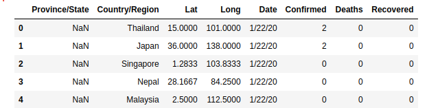
Take a Quick Peek at the Contents of your Dataset
What exactly is the content of your dataset? Pandas head() and tail() helps you with that. By default head() prints the first 5 rows and tail() the last 5 rows of your dataset.
pd.dataset.head() # List the first 10 rows of dataset
#displays the last 5 rows of your dataset
dataset.tail()
You can as well specify the number of rows you want to display by passing the number as an argument to the functions.
#prints the first 10 rows
pd.dataset.head(10) # List the first 10 rows of dataset
#displays the last 10 rows of your dataset
dataset.tail(10)
Sometimes your dataset will have a large number of columns such that you won’t be able to view them all.Unless you are working with a gigantic computer screen. Luckily, with the code code snippet below, you can scroll left and right to see everything. Cool right?
#permits all the attributes(columns) to be displayed
pd.set_option("display.max_columns" , None) #permits all the attributes(columns) to be displayed
dataset.head()

Display Interesting Statistical Information.
Lets take a step further into gaining some statistical insights of our dataset. Personally, the .describe() method is a must-know function.
It provides some invaluable statistical information such as count, mean, standard deviation, etc of each of the numeric columns found in our dataset.
dataset = pd.describe()
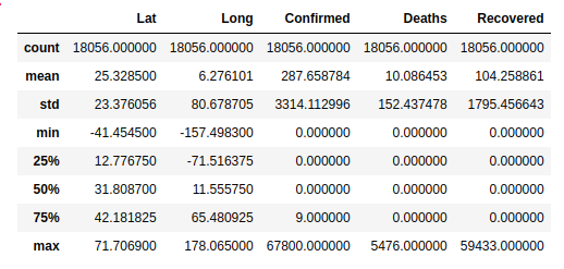
- count row can be especially useful as it gives a clue of any missing values in your data that could negatively affect the performance of your machine learning model.
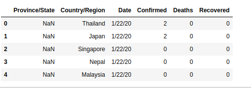
Removing Irrelevant Columns
In building a machine learning model, some features or columns might have zero contribution to the performance of the prediction. You can eliminate any unwanted column by using the snippet below. Axis specifies that it is column.
I dropped the Lat and Long columns in the COVID-19 dataset
clean_dataset = dataset.drop(['Lat' , 'Long'], axis = 1)
clean_dataset.head()
Note: It is good practice to assign the modified dataset to a new variable.
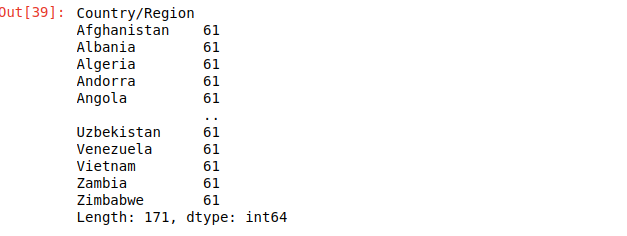
Number of Unique Samples in Dataset
This next code snippet is often very useful in machine learning especially when we are dealing with classification problems. It helps you to know the number of samples that belong to a particular category. An example is shown below
dataset.groupby('column_name').size()
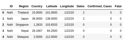
Renaming Weird Column Names
Datasets can be messy at times with wierd column names given by the creators of the datasets. You don’t have to stick with these. If you dont like it, just change it like so.
#list of column names
new_col_names = ['ID' , 'Region' , 'Country' , 'Latitude', 'Longitude' , 'Dates' , 'Confirmed_Cases' , 'Fatal']

# assign the names to your dataset
dataset.columns = new_col_names
Sometimes, you just need to change that specific column name that sounds like gibberish to your ears. Just do this.
dataset.rename(columns = {'old_col_name': 'new_col_name'}, inplace = True)
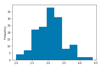
Histogram Plot.
Lets spice things up a little, with visualizations.The first and most commonly use visualization tool is the histogram. We can optional pass bin size as the only argument. That’s it.
dataset["column_name"].plot.hist()
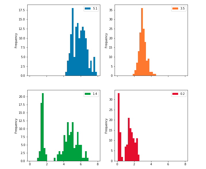
For demonstration purposes, I am also using the Iris dataset to show interesting plots. The link is included at the end of the article.
If you are curious and interested in visualizing the histogram plots of all your features, you can generate generate multiple plots as indicated below. Subplot creates a histogram plot for each column and layout specifies the number of plot per row and column.
dataset.plot.hist(subplots = True, layout = (2,2) , figsize = (10,10) , bins = 20)
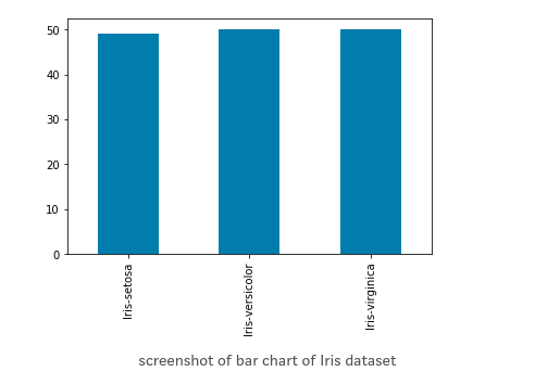
Bar Plot
This is an interesting visualization tool. However, in order to plot a bar chart using the plot.bar() method, we need to first count the occurrences using the value_count() method and then sort the occurrences from smallest to largest using the sort_index() method.
#vertical barchart
dataset['Iris-setosa'].value_counts().sort_index().plot.bar()

#horizontal bar chart
dataset['Iris-setosa'].value_counts().sort_index().plot.barh()
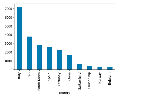
dataset.groupby('country').ConfirmedCases.mean().sorted_value(ascending=False)[:5].plot.bar()
Here is a great example of the bar plot in the COVID-19 dataset. First group data by country, then calculate the mean of confirmed cases and sort in ascending other. Finally, plot a bar chart of the 10 countries with the most number of confirmed cases.
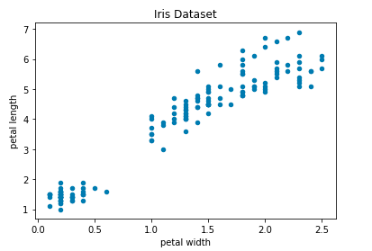
Scatter plot
Last but far from least is the scatter plot. Generally used to show the relationship between 2 columns or feature in your dataset. Note that only numeric columns can be plotted.
## Scatter Plot
dataset.plot.scatter(x='petal width', y='petal length', title='Iris Dataset')
Other Plots
There exist other interesting plots which I decided not to cover these on this post. However, I will mention these here with appropriate links for easy exploration.
Bonus Tip
I came across this article published by towards data science written by Brenda Hali titled My Pandas Cheat Sheet and I found it very helpful. I think it contains very useful and handy pandas functions you will frequently find yourself in need of.
The Takeaway
No matter the dataset you came across on the internet, these simple data exploratory techniques should be the very first idea that runs to your mind. It will permit you to have a clue of what you are dealing with.
Understanding the contents, and relationships of a dataset will help you to decide if it is going to be useful for the project you are working on or its a total waste of time.
When you implement these pandas techniques outline on this post, the battle is already half when it has not started yet. Trust me, It will save you a lot of time and headaches.
Thanks for reading and hopefully it was helpful. If you have other interesting functions you think I and others should know about please, do not hesitate to leave a comment. Let’s learn and grow together.
If you loved this post, feel free to read some amazing post on my blog
References
Link to GitHub jupyter notebook with complete code.
link to Kaggle COVID-19 Dataset
Link to Iris Dataset
https://realpython.com/pandas-python-explore-dataset/
https://towardsdatascience.com/exploring-the-data-using-python-47c4bc7b8fa2
https://towardsdatascience.com/a-gentle-introduction-to-exploratory-data-analysis-f11d843b8184
https://towardsdatascience.com/introduction-to-data-visualization-in-python-89a54c97fbed


Leave a comment